

How I hacked designing MVP features and a design system—in 4 weeks


Have you found yourself in a fast-paced startup where you're required to design a handful of end-to-end features quickly? This can be especially challenging if you're new to the industry.
This was me a few months ago when I joined HAL — a blockchain company that helps Blockchain Devs save time with filtered blockchain data.
In this article, I'll show you a framework you can adopt to design an MVP faster, as well as its design system.
Why worry about a Design System, for an MVP?
You don't have to worry about a design system for an MVP, but you do need to think about an efficient way to design consistent, scalable UI patterns at the start1. Why?
Scalable UI patterns can help improve the user experience by making the interface more consistent and predictable. This can reduce the learning curve for new users and make the application easier to use.
Scalability can help reduce the maintenance and development costs of an application by allowing developers to reuse UI components and patterns across different parts of the application.
It helps to improve the performance of an application, as it can be optimized for different screen sizes and devices. This can help ensure that the application is responsive and performs well on a variety of devices.
How might you achieve this, you ask? One way is to start out with existing Ui patterns of great products. You can find these in Design system repos e.g Design System Repos, Github, and UI pattern libraries like Mobbin.
Back to business, how can you design MVP features faster?
First — Brainstorm and Sketch
Have some wireframes or sketch work done. Asides from being able to communicate your ideas more efficiently, and iterating faster; sketching makes it possible to visualize the UI patterns you’ll be adopting for the product.
Lucky for me at Hal, I was handed some tentative user flows and wireframes.
Brainstorming with High Fi prototypes is not as efficient as you might think. One reason is it fosters stakeholder feedback on areas that can get you caught up in the minutiae of design e.g Colors, typography, visuals, etc., and not the big picture.
Sketching can help designers to stay focused and avoid getting bogged down in the details. By sketching out rough concepts and prototypes, you can keep the big picture in mind and avoid getting caught up in the minutiae of design. This can help you to stay on track and move more quickly through the design process.
Depending on the complexity of the project at hand, have a brainstorming workshop to outline and prioritize ideas to pursue, and sketch them out. You can sketch the most impactful parts of the user flow.
How you sketch is up to you. I prefer to sketch with my notebook because I am able to put down my ideas fast. Although, I plan to substitute it with scribbling on an iPad.
Create a Moodboard for your reference products
Dump screenshots into a board from products you would want your product to look like. My team fancied and voted for the look of PlanetScale, Vercel, and Github.
These products are commonly used by Developers who are our target users. In other words, they’d make them feel at home.2

Inspect and copy the CSS styles from the products in the mood board
This step will be helpful to you if you need to come up with design concepts fast and not have to think about visuals (color, typography etc).
Get started by using the Chrome Inspect Tool to see the CSS properties of the basic Visual Elements like
Colors
Typography
Shadows (for ‘em sexy cards)
Rounded Corners e.t.c
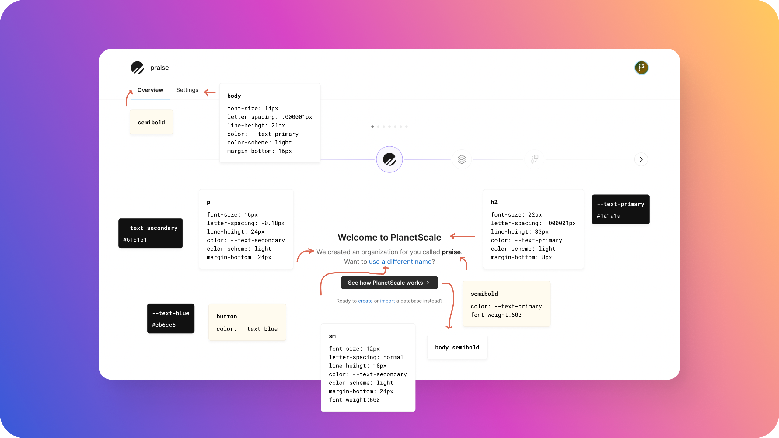
Drop the CSS properties next to the screenshot in your mood board. You can repeat this for as many styles as you want.
Here’s a quick video guide on how to do this.
Mockup some Demo screens to test the styles
Using the styles you copied in the step above, design some mockups for your product to test and adjust them. Do this till you’re just about satisfied with the look and aesthetics.
I suggest mocking up critical pages in your user journey e.g Homepage or Overview. These pages tend to contain a variety of components. This way, you’d be able to determine if the styles are coming together nicely.

Save the styles (and components) in Figma or your preferred design tool.

Bonus
When mocking up your demo pages, you can use UI Kits like Tailwind UI or Flowbite Blocks to boost your productivity. Check if the layout and styles of the UI Kit components closely match what you want. Update the components with the styles you’ve saved on Figma
Design Tokens
What’s a design token (link)? Essentially, a design token is a design decision: a pairing of the same code and visual properties—design elements you use over and over again in your products—packaged in a format that’s deployable across all platforms.
Once you’re done saving the styles on Figma, you can include their design token names. You can ask your Front End engineer to guide you through this. So long you both maintain the same names and naming convention (link).
Learn more about building Scalable UIs